
- in European Union
- in European Union
- with readers working within the Property industries
- within Environment, Real Estate and Construction and Technology topic(s)
Introduction
European architecture has always been famous for its detailed designs that showcase the unique values of different region. From the magnificent towers of Gothic cathedrals to the ornate facades of Baroque palaces, these buildings are more than just functional, they are masterpieces that reflect the artistry of their creators, which are tourist attractions till date. Today, architecture has evolved towards more minimalist designs, with many buildings focusing on simple structures. This conceptual shift can be seen in other areas of life as well, such as interiors, fashion, packaging, and even branding. Many companies are embracing minimalist logos and contemporary aesthetics, which is often praised for its focus on simplicity, clarity, and adaptability.
Recently, many brands have made headlines with their logo rebranding, a shift largely driven by evolving marketing strategies, digital trends, and the growing popularity of minimalism amongst the new generation. This trend reflects the changes in consumer expectations and the competitive landscape. While some rebrands have faced criticism for being too simplistic or disconnected, others have been met with positive market reception, highlighting that when executed well, a fresh logo can rejuvenate a brand's image and bring in a new personality.
For a logo to be successful, its design elements must align with the brand's core values, characteristics, and product features, ensuring it resonates with the consumers and effectively drives purchasing motivation. Ultimately, the move towards minimalist design in logos emphasizes clarity and versatility, reflecting a broader push for branding consistency in an increasingly digital world.
Reasons for Change in Brand Logos:
- Modern Aesthetic:Brands simplify their logos to align with current trends likeminimalismas logos with excessive details can quickly feel outdated. Minimalist designs offer a timeless appeal due to their simplicity and versatility, cutting through the visual clutter. These designs convey confidence in the quality of the product and let the product speak for itself, instead of relying on flashy elements.This approach has been effective inpremiummarkets wherein minimalism is associated with high-quality products for the niche consumers, and luxury brans have transitioned tosimplistic logos,such as-
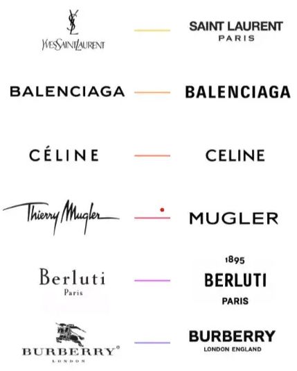
Source:creads.com/blog/decryptage/comment-faire/3-conseils-logo-aux-codes-du-luxe/
Another example of shift tominimalism,is the evolution of the brands,COCA COLAandPEPSI,who have adopted more modern forms, to stay relevant in the competitive market, especially as digital media takes centre stage.
- Digital Friendliness:
Minimalist trade marks provide a seamless user experience across digital platforms, making it easier for the consumers to navigate websites or mobile apps, which contributes to higher engagement rates. The ease of access and adaptability across various platforms eliminates the visual clutter, resulting in improved user experience.
For example, in 2016,INSTAGRAMswitched from a detailed camera icon to a modern and
gradient pink logo
to a modern and
gradient pink logo  to match contemporary
aesthetics.
to match contemporary
aesthetics.
- Similarly,ANIMAL PLANETtransitioned from the
logo
 to simpler font
  , improving readability across various digital
platforms.
, improving readability across various digital
platforms. - Improved Brand Recall:Complex logos can feel
harder for the consumers to associate with a brand, whereas simple
trade marks are generally easier to remember and identify with a
brand. For instance, theAPPLErebranding from
 to
to  is a prime example of how"less can
often be more"when it comes to creating a powerful brand
presence and recognition. It is a clean and simple design,a
sleek apple with a bite taken out,without the need for
excessive detail. This minimalistic approach makes the logo highly
versatile, easily recognizable, and memorable across various
platforms and products. It also resonates with the company's
ethos of being user-friendly considering it is consistent across
all products and allows the consumers to associate it instantly
with premium technology.Another example isZOMATO,
which adopted a text-only logo
is a prime example of how"less can
often be more"when it comes to creating a powerful brand
presence and recognition. It is a clean and simple design,a
sleek apple with a bite taken out,without the need for
excessive detail. This minimalistic approach makes the logo highly
versatile, easily recognizable, and memorable across various
platforms and products. It also resonates with the company's
ethos of being user-friendly considering it is consistent across
all products and allows the consumers to associate it instantly
with premium technology.Another example isZOMATO,
which adopted a text-only logo  , making it easy for consumers to recognize
and recall very easily.
, making it easy for consumers to recognize
and recall very easily. - Market Relevance:A refreshed logo helps a
brand stay competitive and appeal to modern audiences, especially
younger generations (Gen Z and Millennials), amongst the
ever-increasing market competition.For
example,AUDIofficially dropped the overlapping
circles (
 ) in its designs for e-Audi cars
in China (
) in its designs for e-Audi cars
in China ( ), catering to digital
branding needs, and modern audiences. Similarly, to cater to the
modern electric era,JAGUAR,has rebranded from the
logo
), catering to digital
branding needs, and modern audiences. Similarly, to cater to the
modern electric era,JAGUAR,has rebranded from the
logo 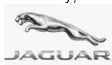 to a simple text-based design
 . Further, the famous automobile
manufacturer,MAHINDRAhas also changed its logo
. Further, the famous automobile
manufacturer,MAHINDRAhas also changed its logo
 to to bring a fresh dynamism as
it represents liberation.
to to bring a fresh dynamism as
it represents liberation.
- Cost-Effectiveness and Production Efficiency: Using fewer elements makes a logo easier to create, reproduce, and adapt for different uses. Therefore, minimalistic logos reduce printing and production costs while also maintaining consistency across platforms.
Challenges and Risks of Changing Brand Logos
While updating marks can be beneficial, itmay notalways work as expected as it can present difficulties ranging from consumer backlash to financial and legal complications. Some of the challenges are given below-
- Consumer Criticism:
Loyal customers may criticize a logo change if it does not resonate with them. For instance, whenJAGUARchanged its logo to a simple text-based design, it faced significant criticism on social media on account of its letting go of its legendary trade mark. Another example is
ofGAP,the famous clothing brand which also
received significant backlash on the logo they adopted in 2010  and went back to its 1986 logo (
 ).
). - Oversimplification and Loss of Brand
Identity:When consumers are attached to a logo, a sudden
and drastic change can break that bond, making them feel
disconnected from the brand. Therefore, it is important to adopt a
logo which aligns with the brand value and communicate the change
properly to the consumers and public at large.There is a
possibility that redesigning a logo to something overly basic
canstrip the brandof its character, and consumers may feel
that the new logo lacks personality. For example, Audi's
removal of its signature circles for the launch
ofAudicars in China disappointed many consumers.
Another example is whenWEIGHT WATCHERSrebranded
from
 to to appear modern, it ended up confusing the
customers, as the new name felt vague and lost its original
identity.
to to appear modern, it ended up confusing the
customers, as the new name felt vague and lost its original
identity. - Sales Impact:The customers may struggle to
recognize a redesigned logo, leading to potential sales drops. A
notable example is ofTROPICANA, which redesigned
its logo
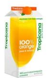 to
to  by removing the iconic orange with a straw.
This change confused customers in offline stores, resulting in a
20% decline in sales.
by removing the iconic orange with a straw.
This change confused customers in offline stores, resulting in a
20% decline in sales.
- Legal and Registration Costs: Brands must re-register their new logos across multiple jurisdictions as even minor changes require updates across branding, promotional materials and legal registrations. This can be time-consuming and expensive. Additionally, such past registrations for older trade marks then becomevulnerable to cancellationfor not being used anymore (in case the change is substantial). Licensing and franchising agreements also would require a relook.
Conclusion
A well-designed logo not only enhances brand recognition but also has the potential to boost sales by generating market buzz and consumer connect and loyalty. However, redesigning a logo is a significant decision that comes with its own risks and challenges. A poorly executed redesign can lead to backlash, confusion, and even, financial strain. Therefore, the key to a successful logo redesign lies in balancing innovation with familiarity, ensuring that the brand maintains trust and recognition while adapting to modern trends. The rebranding should act as a botox and not blanding.
The content of this article is intended to provide a general guide to the subject matter. Specialist advice should be sought about your specific circumstances.

